So what are the popular paint colors for 2016? You might be surprised.
Sometimes the spaces we live in become so familiar to us that we can barely see them anymore.
We can barely see their possibilities, their potential for improvement and change. It is for this reason that paint manufacturers and color forecasters make their yearly predictions about popular color trends in home decor. These predictions give us a chance to redesign and re-imagine our living spaces so that they once again excite and challenge us.
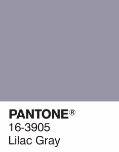
Among the more popular, vibrant, and daring colors trending in 2016 are, according to Elle Decor, three colors which include Rose Quartz, Lilac Gray, and serenity. The blending of the paint colors Rose Quartz and Serenity has even been chosen by Pantone as the color of the year.

Rose Quartz & Serenity

Lilac gray
Other color trends in 2016 include:
- Pale icy blues: Recommended for home offices and workplaces.
- Vibrant emerald greens: Recommended as accents in cushions, throws, draperies and other textiles.
- Metallic gold: Recommended for kitchen accents.
- Mauve: Recommended for girls’ rooms and nurseries.
According to paint giants Benjamin Moore and Glidden, the popular colors for 2016 will be more about more subdued colors. They have both predicted that off-whites and achromatic colors will take their place in many homes and apartments. They see the colors ivory, alabaster, and cappuccino white being dominant in many interior design projects.
Many home décor experts suggest that the colors are more neutral using the furniture as the spotlight. This means employing the use of interesting and unique pieces of furniture, the careful placement of art, and the use of fixtures and other elements to draw some attention from what might be perceived by some as a sterile background. According to many home décor experts white, or shades of white, will be very popular colors in 2016 for bathrooms and kitchens in particular.
The great thing about the yearly forecasts from paint manufacturers and color forecasters like Benjamin Moore and Sherwin-Williams is that each provides a way for customers to test these colors in their homes before opening a single can of paint.
Benjamin Moore does so with its app – ‘Color Capture’ – which can help customers access its more than 3,500 colors and match those colors with virtually any real-life object. Android and iOS users can even share and discuss photos of the colors they choose and that are trending for 2016 with friends via Facebook, Twitter, and email.
Similarly, Sherwin-Williams has an app named ‘ColorSnap’ that does nearly the same thing. However, ‘ColorSnap’ not only matches colors to existing real-world objects, it even applies whatever color you’ve chosen to virtual “sample rooms” so that users can try their colors before starting their DIY projects.
Several other companies and design sites have similar apps to help users make the difficult choice of choosing the right colors for their interior design projects.
Ultimately, the blending and careful application of paint colors create an opportunity for us to renew and re-invigorate our living spaces, to recharge and refresh our mood, and breathe new life into our homes.
Everyone can be helped a bit by those who observe trends in home décor as it gives us inspiration and license to try new ideas.
If you want to learn how to start making money with your hobby get the details HERE
If you want to learn DIY Tricks and Tips get my weekly blog HERE
Artzy Fartzy Creations. Oh Yes you can DIY!
Gold Leafing 101: (Step-by-Step DIY Gold Leafing Guide for Beginners)
How to Apply Gold Leaf: 6-Step DIY Guide [...]
Best Sponge Painting Wall Technique for a Soft, Elegant Finis
Best Sponge Painting Wall Technique for a Soft, [...]
Easy Kids Room DIY: How to Paint Cute, Creative Switch Plates for kids rooms
Creative DIY Light Switch Plate Ideas for Kids: [...]
🪵 How to repair Dings & Dents in furniture
🪵 How to Repair Dings in Furniture [...]
10 Common Painting Mistakes Beginners Make (And How to Fix Them Like a Pro)
10 Painting Mistakes Beginners Make (And Pros Never [...]
How to Stencil (Without Bleed-Through or Fuzzy Edges)
How to Stencil Without Bleed Through If you’ve ever pulled [...]
Contents
Recent Reads
Best Sponge Painting Wall Technique for a Soft, Elegant Finis
Best Sponge Painting Wall Technique for a Soft, [...]
Easy Kids Room DIY: How to Paint Cute, Creative Switch Plates for kids rooms
Creative DIY Light Switch Plate Ideas for Kids: [...]
🪵 How to repair Dings & Dents in furniture
🪵 How to Repair Dings in Furniture [...]


